Detailed
TL;DR


Onesuite lost people mid-onboarding. I found out where and rebuilt the flow around one first win
Onesuite lost people mid-onboarding. I found out where and rebuilt the flow around one first win
Onesuite lost people mid-onboarding. I found out where and rebuilt the flow around one first win
Overview
Onesuite gives agency founders one place to run the whole business, from first estimate to final invoice, instead of stitching together five separate tools.
I designed the product end-to-end, from CRM through invoicing. This story is about onboarding: the part that was losing people before they ever got in.
Before
After


Before
After
Problem statement
Onesuite was winning customers and losing them in the same afternoon
Onesuite was winning customers and losing them in the same afternoon
Onesuite was shipping fast. New modules every quarter, 4.6 on G2, strong reviews on Capterra. The people using it were happy and said so publicly.
Onesuite was shipping fast. New modules every quarter, 4.6 on G2, strong reviews on Capterra. The people using it were happy and said so publicly.
Nobody was looking at how many people never became users at all. I pulled the account creation and activation funnel and read it against the review data.
Nobody was looking at how many people never became users at all. I pulled the account creation and activation funnel and read it against the review data.


62% of new accounts never completed setup. They created a login and left before reaching the product.
62% of new accounts never completed setup. They created a login and left before reaching the product.
41% dropped at module selection, the single largest fall in the funnel.
41% dropped at module selection, the single largest fall in the funnel.
Median time to abandonment was 3 minutes 40 seconds, roughly the point where the fourth screen loads.
Median time to abandonment was 3 minutes 40 seconds, roughly the point where the fourth screen loads.
Of the people who finished setup, 71% returned within a week. The product worked. Getting to it didn't.
Of the people who finished setup, 71% returned within a week. The product worked. Getting to it didn't.
The funnel showed where people left. It couldn't show why.
Diagnosis
People came for one thing.
Setup asked them to plan for ten
People came for one thing.
Setup asked them to plan for ten
The funnel gave me a step. To understand what was happening on it, I watched what people actually did there, and worked out what they had come to do in the first place.
The funnel gave me a step. To understand what was happening on it, I watched what people actually did there, and worked out what they had come to do in the first place.


Recordings showed hesitation, not confusion. People scrolled the module list, scrolled back up, and left. Nobody got stuck. They couldn't decide.
Recordings showed hesitation, not confusion. People scrolled the module list, scrolled back up, and left. Nobody got stuck. They couldn't decide.
Sales notes kept asking one question. "Which ones should I turn on?" Before anyone had seen the product.
Sales notes kept asking one question. "Which ones should I turn on?" Before anyone had seen the product.
Reviews showed why people came. Each named one module, never the range. People arrive with one job, not ten.
Reviews showed why people came. Each named one module, never the range. People arrive with one job, not ten.
A walkthrough confirmed it. Module selection asks for a decision the product hasn't given people enough to make.
A walkthrough confirmed it. Module selection asks for a decision the product hasn't given people enough to make.
Setup wasn't too long. It asked people to commit to everything before giving them anything.
What I tried first
I made setup shorter. People would still have left
I made setup shorter. People would still have left
The obvious reading of the funnel was that setup was too long. So that's what I fixed first.
The obvious reading of the funnel was that setup was too long. So that's what I fixed first.
Attempt one: cut the steps
I merged company details into workspace setup, and moved team invites and billing to after first use. Six screens became three.
I merged company details into workspace setup, and moved team invites and billing to after first use. Six screens became three.
It looked like progress. But module selection was still there, still in the middle, still asking the same question nobody could answer. I had built a shorter path to the same wall.
It looked like progress. But module selection was still there, still in the middle, still asking the same question nobody could answer. I had built a shorter path to the same wall.

Attempt two: recommend the modules
If people couldn't choose, maybe the product could choose for them. I added one question about agency type and size, then pre-selected a set of modules to match.
If people couldn't choose, maybe the product could choose for them. I added one question about agency type and size, then pre-selected a set of modules to match.
It was easier to click through. But pre-ticked checkboxes are still a decision, just a quieter one. And when the recommendation was wrong, it told a new user the product didn't understand them, in their first minute inside it.
It was easier to click through. But pre-ticked checkboxes are still a decision, just a quieter one. And when the recommendation was wrong, it told a new user the product didn't understand them, in their first minute inside it.

How I judged them
I held both against the diagnosis. People didn't leave because setup was long. They left because it asked for a decision they had no way to make. One attempt moved that decision, the other disguised it.
I held both against the diagnosis. People didn't leave because setup was long. They left because it asked for a decision they had no way to make. One attempt moved that decision, the other disguised it.
The moves in attempt one were still right, so I kept them. They just weren't the fix.
The moves in attempt one were still right, so I kept them. They just weren't the fix.
The problem wasn't the number of screens. It was the question on one of them.
The decision
Ask what they came to do, not what they might need
Ask what they came to do, not what they might need
If the question was the problem, the question was what I had to change. Before writing a new one, I looked at how other products ask theirs.
If the question was the problem, the question was what I had to change. Before writing a new one, I looked at how other products ask theirs.
How other products start
I went through the first five minutes of five products that new users open with no idea yet what they need. Three patterns kept showing up.
I went through the first five minutes of five products that new users open with no idea yet what they need. Three patterns kept showing up.
They ask about intent, not setup. Notion and monday.com ask what you want to use them for, then shape the first screen around the answer.
They ask about intent, not setup. Notion and monday.com ask what you want to use them for, then shape the first screen around the answer.
They show the product before asking for anything. Stripe lets you work in test mode before you've finished activating your account.
They show the product before asking for anything. Stripe lets you work in test mode before you've finished activating your account.
They hold features back until they're needed. None of them show everything on day one. The rest appears as you use it.
They hold features back until they're needed. None of them show everything on day one. The rest appears as you use it.
Onesuite did the opposite of all three.
Onesuite did the opposite of all three.

The change
Before: Which modules do you want to use?
Before: Which modules do you want to use?
After: What do you want to do first?
After: What do you want to do first?
One answer switches on one module, drops the person straight into a real task, and holds the other nine back until they're needed.
One answer switches on one module, drops the person straight into a real task, and holds the other nine back until they're needed.
Why it holds
People hire a product for one job. Nobody signs up for ten modules. They sign up to send an invoice, or share a project with a client. The first screen should ask about that job.
People hire a product for one job. Nobody signs up for ten modules. They sign up to send an invoice, or share a project with a client. The first screen should ask about that job.
More options, slower decisions. Ten modules with no information to choose between is the worst version of it. One question with five plain answers isn't.
More options, slower decisions. Ten modules with no information to choose between is the worst version of it. One question with five plain answers isn't.

The bet
I wrote the bet down before designing a single screen.
I wrote the bet down before designing a single screen.
If new users are asked what they want to do first, instead of which modules they want, more of them will reach a first finished task. People arrive with one job, not ten. It's working if setup completion goes up and no new step becomes the wall.
If new users are asked what they want to do first, instead of which modules they want, more of them will reach a first finished task. People arrive with one job, not ten. It's working if setup completion goes up and no new step becomes the wall.
One question was the idea. The screens had to make it feel that easy.
The solution
Every screen now moves people toward one finished task
Every screen now moves people toward one finished task
The new onboarding follows one rule: nothing appears before it's needed. Each screen below makes one decision to keep that rule.
The new onboarding follows one rule: nothing appears before it's needed. Each screen below makes one decision to keep that rule.

One question, five answers, each written as a task rather than a module name. A quiet "I'll look around first" link lets experienced people skip straight in.
One question, five answers, each written as a task rather than a module name. A quiet "I'll look around first" link lets experienced people skip straight in.
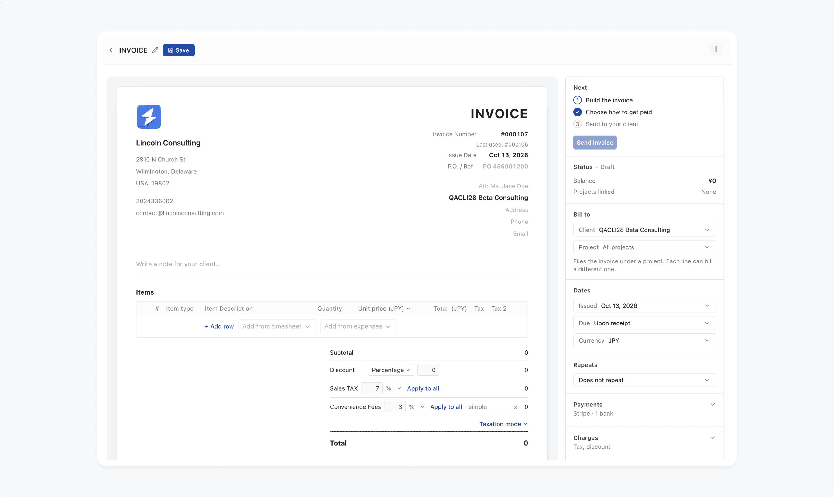
Choosing "send an invoice" opens a real invoice, not a tour. Company name and address are asked for inside it, where people can see why they're needed.
Choosing "send an invoice" opens a real invoice, not a tour. Company name and address are asked for inside it, where people can see why they're needed.

Sending the first invoice gets a moment of its own. The screen offers one next step, not a menu of everything else.
Sending the first invoice gets a moment of its own. The screen offers one next step, not a menu of everything else.

The other modules stay out of the way until the work calls for them. After an invoice goes out, Onesuite asks whether to track the hours behind the next one.
The other modules stay out of the way until the work calls for them. After an invoice goes out, Onesuite asks whether to track the hours behind the next one.

Team invites and billing moved to a short checklist that appears after the first task. Once people have seen the product work, they have a reason to finish setup.
Team invites and billing moved to a short checklist that appears after the first task. Once people have seen the product work, they have a reason to finish setup.

Sign-up to a sent invoice in one unbroken flow.
Sign-up to a sent invoice in one unbroken flow.
It made sense on screen. The harder question was how I'd know it worked.
Validation
I decided what would prove me wrong before anything shipped
I decided what would prove me wrong before anything shipped
A redesign that only looks better proves nothing. So before calling the flow done, I set out what I'd measure, how I'd test it, and what result would tell me I was wrong.
A redesign that only looks better proves nothing. So before calling the flow done, I set out what I'd measure, how I'd test it, and what result would tell me I was wrong.
What I'd measure
Setup completion. The main number. Today only 38% of new accounts finish.
Setup completion. The main number. Today only 38% of new accounts finish.
Drop at the first question. The new question shouldn't become the new wall.
Drop at the first question. The new question shouldn't become the new wall.
Time to first finished task. From sign-up to the first sent invoice, estimate or tracked hour.
Time to first finished task. From sign-up to the first sent invoice, estimate or tracked hour.
Week-one return. Today 71% of people who finish come back. That shouldn't fall as more people get through.
Week-one return. Today 71% of people who finish come back. That shouldn't fall as more people get through.

What would prove me wrong
Starting with one job could keep people in one module for good. If most people who start with one task never turn on a second module within 30 days, the flow has traded one problem for another.
Starting with one job could keep people in one module for good. If most people who start with one task never turn on a second module within 30 days, the flow has traded one problem for another.

How I'd test it
Half of new sign-ups get the new flow, half keep the old one. I'd run it until each group had enough sign-ups to trust the difference, then read the guardrail at 30 days before switching everyone over.
Half of new sign-ups get the new flow, half keep the old one. I'd run it until each group had enough sign-ups to trust the difference, then read the guardrail at 30 days before switching everyone over.
The plan tests the flow. It doesn't test my assumptions about the answers.
Reflection
I'd defend the question.
I'd test the answers sooner
I'd defend the question.
I'd test the answers sooner
What I'd defend
Replacing the module list with a question about the job. The old question had no right answer for someone who hadn't seen the product yet. Even if the numbers moved less than I expect, I wouldn't go back to asking it.
Replacing the module list with a question about the job. The old question had no right answer for someone who hadn't seen the product yet. Even if the numbers moved less than I expect, I wouldn't go back to asking it.
What I'd do differently
The five answers came from reviews and sales notes. That's real evidence, but the list is my reading of it. Before building a single screen, I'd put it in front of five agency founders and ask which one they'd pick and why. The list is the riskiest part of the design, and it's the part I checked least.
The five answers came from reviews and sales notes. That's real evidence, but the list is my reading of it. Before building a single screen, I'd put it in front of five agency founders and ask which one they'd pick and why. The list is the riskiest part of the design, and it's the part I checked least.

What I'd watch
Whether starting with one job narrows how people use Onesuite later. It's the guardrail in the test, and it's the thing I'm least sure about.
Whether starting with one job narrows how people use Onesuite later. It's the guardrail in the test, and it's the thing I'm least sure about.
The question was the right one. The answers deserve a conversation.
Showcase
The new
first five minutes
More of Passify,
beyond the journey.


Contact
Have a role in mind?
imran.uxi@gmail.com
Copied
© 2026 Imran. All Rights Reserved.
Contact
Have a role in mind?
imran.uxi@gmail.com
Copied
© 2026 Imran. All Rights Reserved.
Contact
Have a role in mind?
imran.uxi@gmail.com
Copied
© 2026 Imran. All Rights Reserved.
Contact
Have a role in mind?
imran.uxi@gmail.com
Copied
© 2026 Imran. All Rights Reserved.
Contact
Have a role in mind?
imran.uxi@gmail.com
Copied
© 2026 Imran. All Rights Reserved.